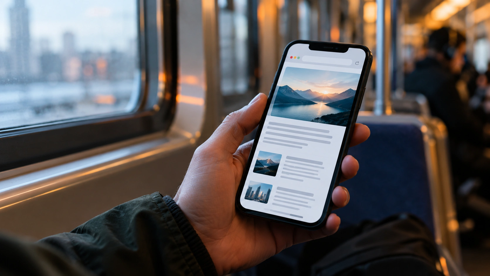
The owner of a small online shop looks at her site on a laptop every evening: everything is even, the photos are large. Buyers open it on a phone in the metro. The page slides sideways under the finger, the Buy button ends up beyond the screen edge and the person closes the tab. She never learns it: the order simply does not arrive.
Why a website scrolls sideways on a phone
Most often the cause is a single element wider than the screen: an image, a table, a banner or a long link. The phone has nowhere to put it and stretches the whole page. This is called horizontal scrolling (when you can drag a page sideways, not just up and down). On a screen 360-414 pixels wide it happens with any block that has a fixed width of a few hundred pixels. To see exactly where the layout (how elements are arranged on the page) breaks, use the free responsive test: it opens the site on seven screens and marks the problems.
Why it costs money
According to StatCounter for September 2026, phones bring 58.99% of world web traffic, desktops 39.26% and tablets 1.76%. Google also indexes and ranks the mobile version of a site: its search documentation says it uses the mobile content crawled with the smartphone agent. If a page is awkward on a phone or holds less than on a desktop, the site can lose traffic.
1. An image or table wider than the screen
A photo with a hard width, a wide price table or an embedded video stretches the page. Give images max-width: 100% and put the table in a container that scrolls inside, so that only it moves, not the whole page.
2. A long word or link does not wrap
An address, an email or a name without spaces cannot wrap and pushes the page out. The overflow-wrap: anywhere property lets the browser break such a string anywhere so it stays inside its container. It has worked in all major browsers since October 2018.
3. Buttons are too small
The WCAG 2.2 accessibility standard (criterion 2.5.8, level AA) requires a tap target of at least 24 by 24 CSS pixels, or free space around it. Links inside sentences are exempt. The web.dev recommendation is stricter: about 48 pixels with roughly 8 pixels between neighbouring targets, because that is the size of a fingertip. When two small links stand together, the finger hits the wrong one.
4. The text is too small
The standard sets no lower limit, but in practice text under 12 pixels on a phone is readable only with zoom. Body text is sensibly kept at 16 pixels or more so the browser does not need to zoom the page by hand.
5. The mobile version holds less than the desktop one
For indexing Google takes only what is shown on the phone. If part of the text, sections or descriptions are hidden on mobile, traffic may drop when the site moves to mobile-first indexing. Instead of removing content Google suggests moving it into accordions or tabs: space is saved and the text stays on the page.
6. Tested on one phone only
Phone screens differ. According to StatCounter for September 2026, the most common mobile resolutions are 414 by 896 (13.35%), 360 by 800 (7.54%), 384 by 832 (7.1%) and 390 by 844 (6.05%). What looks right on your phone can break on the next one. That is why a check of seven sizes, from a 4K TV to the narrowest phone, finds more than one test screen.
How to find the culprit in an evening
Start by opening the site on a phone and finding the page that moves sideways. On a computer, press F12 in the browser and switch on phone emulation: the page appears in a narrow window. Then look for the block whose right edge goes beyond the screen. Most often it is an image with no width limit, a table, a video or a banner, and sometimes a long link. The fix is usually one or two lines of styles: limit image width, allow long words to wrap, wrap the table in a container that scrolls.
Then check the buttons: tap each one with a finger, not a cursor. If you have to aim, enlarge the button or add space. Finally open the site on the narrowest phone in the list, because that is where what looked fine on other screens breaks.
How to test every screen in a minute
- Open the Awe Check responsive test.
- Paste the site address.
- Review the shots on a 4K TV, large monitor, Full HD, laptop, tablet, phone and small phone.
- Read the note under each screen: page wider than the screen, small buttons or small text.
If a theme or plugin update may break the layout again, with Awe Check Pro the site is checked on a schedule and the alert arrives in Telegram. For a broader site review see our piece on silent customer leaks.
Today, open your site on a phone and swipe sideways. If the page moves, you have an element wider than the screen and it is time to find it.
Sources
- Google Search Central: mobile-first indexing - Google uses the mobile version for indexing and ranking.
- W3C: WCAG 2.2, criterion 2.5.8 Target Size (Minimum) - 24 by 24 CSS pixels and exceptions.
- StatCounter: platform share, September 2026 - 58.99% mobile.
- StatCounter: mobile screen resolutions, September 2026 - the most common sizes.
- MDN: overflow-wrap - how to break a long string.
- web.dev: Accessible tap targets - about 48 pixels with 8 pixels between targets.